
Now that the holidays are over and the bright lights and glittery decor put away, does your home feel a little “blah?” Well, do I have a solution for you! Every year the Benjamin Moore paint company forecasts colors for the year. This color palette involves a “yearlong observation of design, art, fashion, environmental and cultural influences” all over the world. The colors are chosen from Benjamin Moore’s extensive line of 3,500+ hues. After months of research and travel, common colors in fashion, design, and art begin to take shape. “The result is a thoughtfully curated color palette…that inspires us all.”
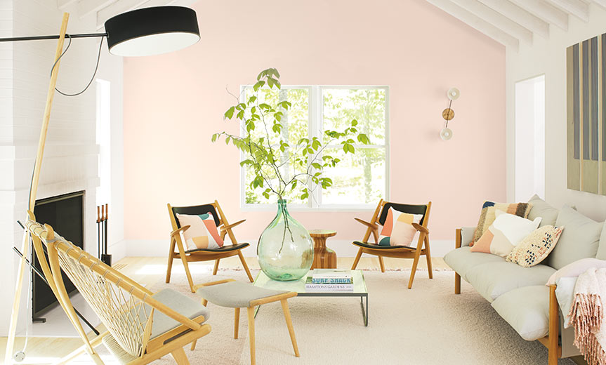
“Benjamin Moore’s Color of the Year 2020, First Light 2102-70, is the backdrop for a bright new decade. The ten harmonious hues of the Color Trends 2020 palette, including First Light, deliver modern paint color pairings that combine optimism with understatement, a timeless way to lighten up.” This year’s colors are an array of pastels and bold neutrals; a far cry from the grays and whites that we’ve been seeing in past years.
A refreshing wash of pink to brighten any space, First Light 2102-70 uplifts.
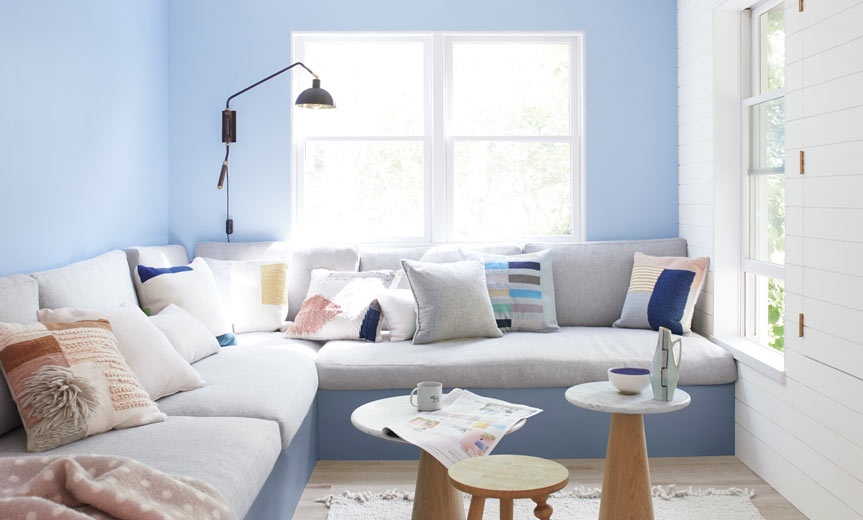
A perfect neutral that floats between warm and cool and coordinates with any decor (pictures on wall), Thunder AF-685.
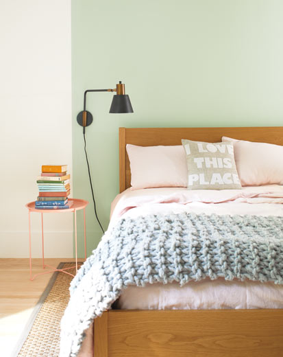
An effervescent, silvery jade, Crystalline AF-485 invigorates.
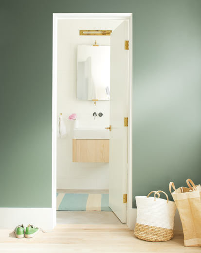
Earthy and enveloping, Cushing Green HC-125 anchors.
Like perfectly faded blue jeans, Oxford Gray 2128-40 comforts and coordinates with neutrals.
A playful periwinkle, Windmill Wings 2067-60 adds a pop of color to any space.
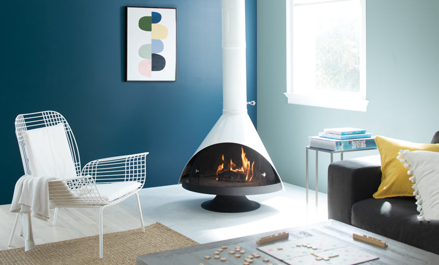
An easygoing blue-green, Buxton Blue HC-149 calms (color pictured on window wall). A deep sapphire, Blue Danube 2062-30 add a splash of elegance to your space (color pictures on art wall).
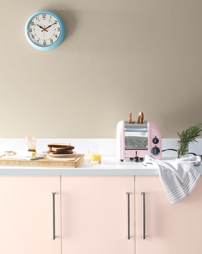
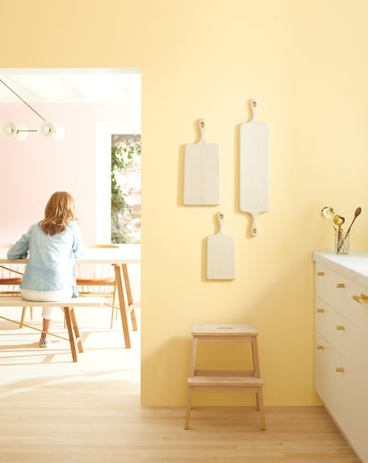
A cross between honey and cream, Golden Straw 2152-50 illuminates and adds a warm wash to any room (color pictured on wall).
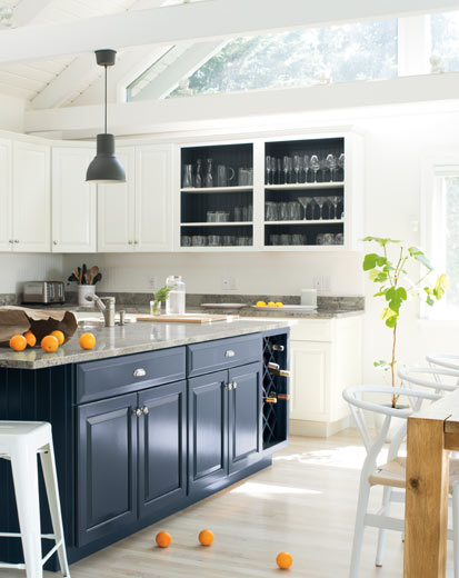
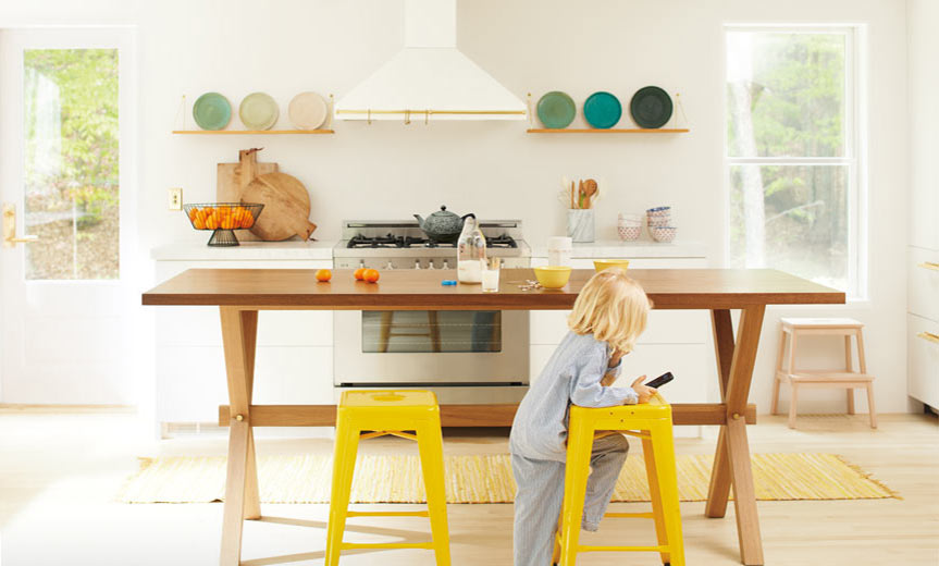
Clean and cool, White Heron OC-57 refines (color pictured on cabinets and walls).
*Credits: https://www.benjaminmoore.com/en-us/color-overview/color-palettes/color-of-the-year-trends-2020